Currently, in many cities in Europe, there are already several e-shared mobility stations with additional features, which are essentially eHUBS. However, there is little recognition of the concept of eHUB, for both city planners and users. A clear and recognisable visual identity used throughout Europe is expected to lead to increased quality, usage and accelerated implementation across European cities and regions. The eHUBS consortium has therefore opted for a clear image to help facilitating and promoting multimodal travel through shared mobility. This visual identity is based on recognizable logos and icons.
THE LOGO
The design of the pointer for eHUBS is not coincidental, as it is inspired to the placeholders that we can find on Google Maps or on other digital mapping applications. The letter “M” of mobility runs through the pointer. The pointer makes the link between the physical eHUB and the digital world.
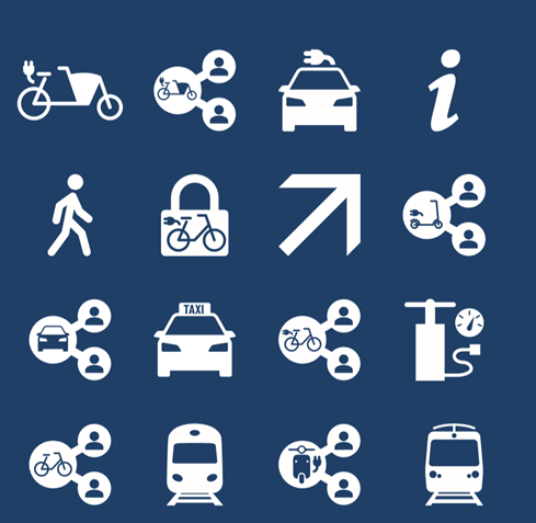
THE ICONS
Partner cities will use the same set of icons for their eHUBS. The icon database finds its origin in the Dutch Green Deal Carsharing and is a result of intensive European cooperation and dissemination with other EU-projects on shared mobility. The eHUBS-consortium enlarged the icon database with new e-shared mobility icons.
To know more about the eHUBS visual identity and branding strategy, take a look at the Deliverable Report 3.1 Visual branding eHUBS.